Logos are the gateway to a business. They act as a front door to your brand. When your customers look at your logo, they immediately form a connection with your brand. Your logo design needs to be unique and spectacular. But what makes a logo one of a kind?
Famous businesses tend to attach a visual identity to their brand. Their logos inspire loyalty and trust. When it comes to famous brand logos, we all know a few that will go down in history. These are the top fifteen brand logos that are some of the most famous ones in the world!
- Apple
The Apple logo is one of the most famous logos in the world. Apple’s customer relationship is strengthened by its recognizable and simplistic logo. This logo denotes the spread of knowledge combined with the use of technology. Apple implements the foundations of minimalism to bring out a logo that is recognizable by all.
- Ford

This world-renowned automobile brand’s logo first made its debut in the early 1900s. it was a beautiful and artistic border that framed the business’s name in serif-block typography. According to the trends of that time, this logo was quite unique and modern.
A few years later, Ford rebranded and presented their new logo as the one we know now. It is said to be modelled off a signature of Ford himself. These days, we can find signature-based logos all around the world. They are widely popular and stand out from the rest by being minimalistic and strong. Ford’s logo certainly paved the way for other famous signature-based logos.
- Chanel

Chanel’s logo is absolutely iconic! Chanel’s bags, jewellery, belts, and other accessories are well-known all around the globe for their exquisite designs and impeccable quality! Chanel items have become a status symbol, and its logo certainly signifies that.
Chanel’s logo was designed by the founder of the brand, Coco Chanel, who used a design technique known as letterplay and interlocked two Cs to form a brilliant and new design. This logo was one of the first few logos in the world to make use of letterplay to create a visually appealing experience for the viewers. Chanel’s logo is memorable and artistic – which makes it one of the most historically famous brand logos in the world.
- Columbia Pictures
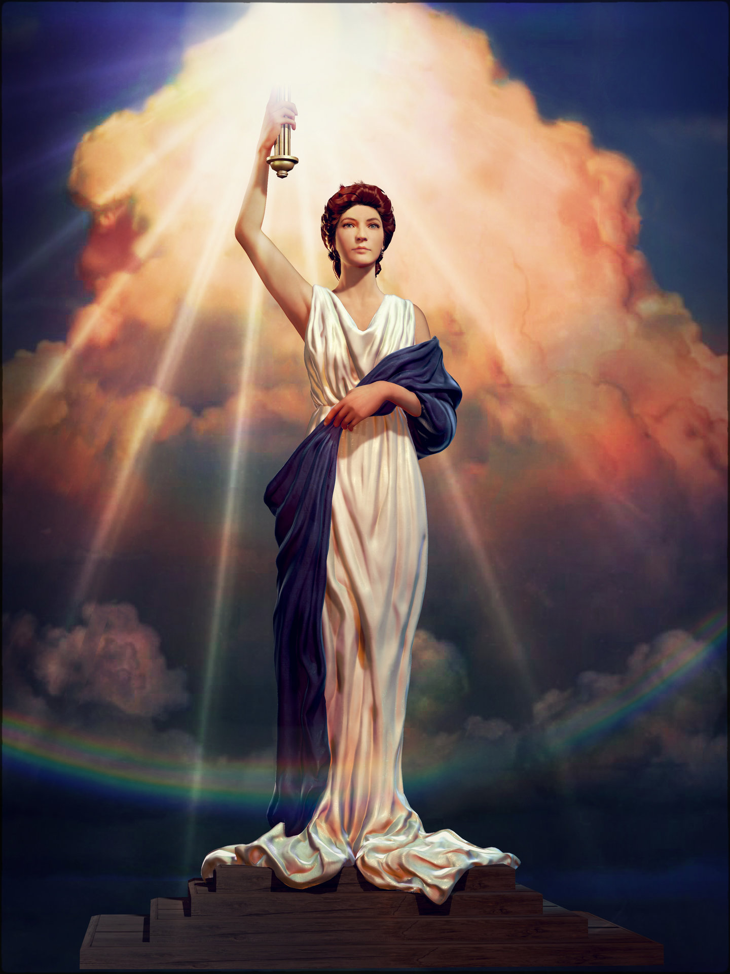
Simply put, Columbia Picture’s logo is exceptionally captivating! This historic logo represents a Grecian woman draped in an American flag holding a torch in her right hand. This logo represents a neoclassic style by featuring caryatids and arches. The Columbia Pictures logo is timeless and classic! It is quite elegant, as well.
- Volkswagon

Did you know that Volkswagon was the business idea of Adolf Hitler who wanted an automobile that was accessible for all? It was! Volkwagon’s original logo was surrounded by a swastika.
After the second World War, Volkswagon lost a lot of business. The British took over the company, and completely rebranded it. They removed the swastika signs and re-coloured the logo. It was then sold back to the Germans and served as a sign of peace and rebirth.
Today, Volkswagon’s logo is one of the most well-recognized ones in the world. The company stands for something, and it’s simplistic, silver logo certainly portrays that.
- NASA
NASA’s logo is the first one that pops in mind when you think of famous logos! This logo has become one of the most prominent ones in the United States history. The original NASA logo features a round-shaped planet that was coloured blue. It features stars and vectors representing astronauts too. It includes a thin, white ellipse that is supposed to signify space travel.
NASA’s logo shape has become one of the most popular ones in history. Nowadays, ellipses are very commonly used in logo designs. They convey movement and are more unique than circular-shaped logos, that are used frequently in logos. Modern-day logos feature ellipses quite often.
- IBM

IBM is the kind of brand that evolves with time! This company certainly reinvented itself to keep us with the changing times. Its logo has done the same. It has changed many times in the course of the company’s lifecycle. In 1966, the famous logo designer Paul Rand redesigned IBM’s logo, which consisted of a block letters in a bold font, made of 13 blue stripes. This was later changed to 8 blue stripes in 1972. According to IBM, the horizontal blue stripes stand for speed and dynamism. Using stripes in your logos opens up a world of possibilities in logo design. This logo is not just bold and creative, but it is also meaningful and portrays the message of its brand.
- Nike
The origin of the Nike logo came from a student named Carolyn Davidson, who originally designed the logo in 1971. She was awarded with shares of the company when it went big in 1983.
This sleek and futuristic logo was inspired by the Greek goddess of victory, Nike. She was known far and wide because of her wings, which were incorporated in the Nike logo, along with a check mark. This unique and abstract logo has won the hearts of many, and today Nike has become one of the most famous brands in the world. Its logo expresses speed, flexibility, and agility. This communicates the brand identity perfectly. If you are looking for a creative logo idea and decide to go for an abstract design, you must ensure that your logo represents your branding and marketing in an ideal manner.
- MTV

If you have ever had a television in your household, you must have heard of MTV. The MTV logo first debuted in 1981. In the logo, the letter ‘M’ was coloured yellow with shades of blue, and the letters ‘T’ and ‘V’ were red. This was MTV’s attempt to showcase that it was an innovative new channel and was ready to reinvent modern-day television. They had a modernistic repute and their logo definitely signified that.
MTV’s logo changed with the years many times. It changed its logo design, colours, and patterns to keep up with the changing times. Its shape remained the same, so it was easy enough to identify, but the changing logos attracted the attention of many viewers. It came across as exciting and new! Once it had established its design, MTV saturated its audience with the logo to build recognition and popularity. This way the consumers were always able to identify MTV with no problem.
- The World Wildlife Fund (WWF)

WWF’s logo featuring a panda is one of the most popular ones! It is an influential logo that makes use of negative space to portray a message that resonates with the brand identity of WWF.
This logo was inspired by a panda called Chi-Chi that resided in the London Zoo in the early 1960s, when the World Wildlife Fun was founded. There have been minor changes to the logo over the past years, but the most significant change was in mid-1980s, when the panda was changed from a traditional black-and-white line drawing to an abstract panda shape, mainly shown by negative space. This gave the logo a sophisticated and modern look, and many logo designers followed suit.
- Windows
Microsoft Windows was launched in mid-1980s, but it wasn’t until the early 1990’s that the tech company really took off. The globally famous Windows logo first made its appearance in 1992 when the Windows 3.1 version launched.
This spectacular logo is a multi-coloured representation of a real-life window. Over the years, the Windows logo has gone through several changes, but the structure of a window has always remained the same. It uses a four-quadrant layout that represents a variety of business aspects in a creative way. If you want to go for a four-quadrant layout for the logo design of your brand, make sure that you put your own spin on it!
- FedEx
FedEx is a company that transports goods and packages around the world. Its logo incorporates a hidden arrow in the white space between the letters ‘E’ and ‘X’ which complements the brand identity fully. This logo first made its appearance in 1944 and used the technique of creating layers that signified visual meaning. Logo designers use this technique to express brand identity in new and creative ways. Logo designers today aspire to hide meaningful shapes within logos so the logo is unique and different.
- BMW

BMW was founded in 1917 and the logo was registered later that same year. It features a simple black ring encircled by a checkered pattern of blue and white. BMW’s initials are emblazoned on the top of the logo. This exceptional logo makes use of bold colours and geometric shapes to create a design that is memorable and stands out from among the rest. BMW’s logo exudes grandeur! If your prime purpose is to create a logo that is influenced by BMW’s design, you can use the technique of creative colour-blocking in many different ways.
- Mercedes-Benz

The Mercedes-Benz logo is a simplistic logo that is recognized around the world in an instant. This logo is absolutely timeless! It made its debut in 1909 with an elegant design that is still one of most easily recognizable ones in the world.
The Mercedes-Benz logo features a star with three points placed delicately inside the confines of a silver circular ring. This star is influenced by a similar star that was hand-drawn by the founder of Mercedes-Benz, Gottlieb Daimler, on a postcard that he sent his wife. He wanted the star to shine over his business and generate prosperity and wealth.
The three points of the Benz logo stand for land, air, and sea, which are known as the three arms of the Benz business. This logo is quite clean and minimalistic which adds to its popularity and value. If you are going for a logo that uses elements of minimalism like the Mercedes-Benz logo, make sure that you for something truly authentic and original.
- United Parcel Service (UPS)

UPS is one of the top package delivery companies in the world. Known globally for their impeccable delivery service, this brand has an excellent and simplistic logo. The UPS logo has been changing long-since, but one element has always remained unchanged. The shield! The UPS logo has always featured a shield. This shield signifies trust, strength, and protection.
UPS aspires to instill reliability and security within its customers. Shield-based logos tend to do that. If you want to create a logo that builds trust with your consumers, make sure you take your own spin on the shield-based logo design. If you want your logo to resonate with your brand identity, you must allow your brand to guide your logo design process.


