

Websites are the modern way of displaying numerous kinds of information. Think about it. You have a query. What do you do? You access one of the most famous search engine websites, www.Google.com, and type in your question. Boom! A list of websites that answer your question in different ways is immediately at your disposal.
Websites are accessed by thousands of people to acquire information about a variety of diverse topics. In today’s time, businesses and brands have their own websites so their customers can reach them easily and learn about their services in a simple and easy manner. But in order to keep your target audience’s attention on your website, you need to have a unique layout that stands out amidst your competitors in the industry.
What is a Website Layout?
Website layouts are the frameworks that define a website’s structure. These can follow a variety of patterns and styles, depending on the preference of the host and the content on the website. The role of a website layout is to structure the data present on the website in such a way that it clearly depicts the navigation path within webpages and puts the key elements of the website in the very center, so users come across it as soon as they open the website.
Although website layouts come in all designs and patterns, some of them never grow old. The following are some examples of website layouts that are growing increasingly popular amongst users, and are likely to be a part of the website layout trends for next year.
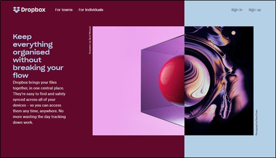
- Split Screen Layout
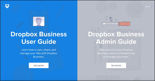
A split-screen website layout is one where the screen of the website is divided into two equal parts, consisting of the main pieces of information on the website. This layout is mostly used when it is equally important to highlight two pieces of content on a website.
For example, on an e-commerce website landing page, the content must be divided between clothing for men and clothing for women. Split screens allow the user to focus on both key sets of information at once. The user can take a journey from either side of the split screen and navigate to their preferred page.
If you are using this website layout, it would be best if you didn’t use too much content on either section of the split. You can also offer a more dynamic experience as opposed to a simple, static one by adding responsive and interactive elements of animation and design.
- Asymmetrical Website Layout
When it comes to websites, users are habitual to an evenly symmetrical and balanced layout. What makes the asymmetrical layout unique is the lack of symmetry and equality. Asymmetry is one of the most favorite design techniques of digital artists and designers around the world. It has only recently spiked in popularity within website layouts.
The aim of an asymmetrical layout is to achieve a balance using unequal weights for the key pieces of information on the Home Page. Using asymmetry creates a kind of dynamism that allows the user to focus on more than one individual objects on the page. With an asymmetrical layout, the user is kept engaged by the visually uneven and yet aesthetically pleasing website layout at all times.
- A Grid of Cards Website Layout
A grid of cards layout is perfect for if you want to pack a lot of clickable information on a single page. This website layout allows web designers to display a ton of content on a single page in the form of small, packet-sized cards of information. Like YouTube, this grid of cards can help the user peruse through the website easily, and find the item they are looking for. The users can dive into the details by simply clicking on the card they wish to select.
One of the most crucial benefits of using the grid of cards layout is that it is extremely easy to customize. You can increase the size and space of the grids, as well as add or remove columns or rows. The style of the cards can also be changed according to the preference of the web designer. The grid of cards layout also works quite well when implemented with a responsive grid.
- Box Website Layout
The box layout consists of a huge central box that is the same width as the header, along with a few smaller sized boxes. There can be a minimum of two and a maximum of five small boxes. These are usually clickable boxes that navigate the user to a different page.
This versatile layout can be used by web designers and web design enthusiasts to create a personal portfolio website, as well as by e-commerce websites to display items for sale that fall under different categories. If you decide to use the box website layout, it is ideal if the major header-sized box on the page is used to showcase items while the small-sized boxes offer details about the items.
- Featured Image Website Layout
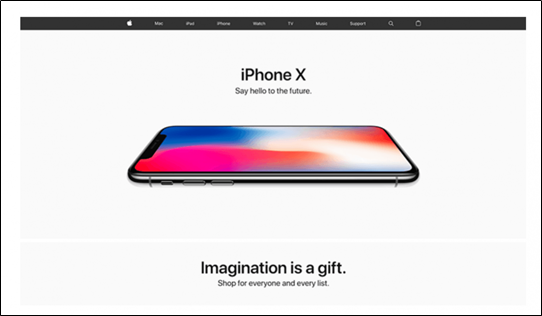
Featured image layouts are used by web designers when they want to showcase only one unique product. Brands often believe that the quickest way to sell an item is to use images and photographs. This layout brings that concept to life. It creates an emotional connection between the user and the featured image – and this makes a solid statement, as well as a spectacular first impression.
- Single Column Website Layout

Single column website layouts are a simplistic layout format where the main content is displayed in a single, vertical column just like this website of Juxiang the Paper Shopping Bag Manufacturer. This layout is incredibly easy to navigate for users. All you have to do is scroll down to see the rest of the content.
This type of layout is one of the most popular ones for websites right now. The main reason for this is that not only do they fit on desktop screens, they fit quite well on smartphone screens, as well.
